|
|
|
|
Time-frequency analysis of seismic data using local attributes |
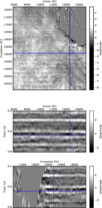
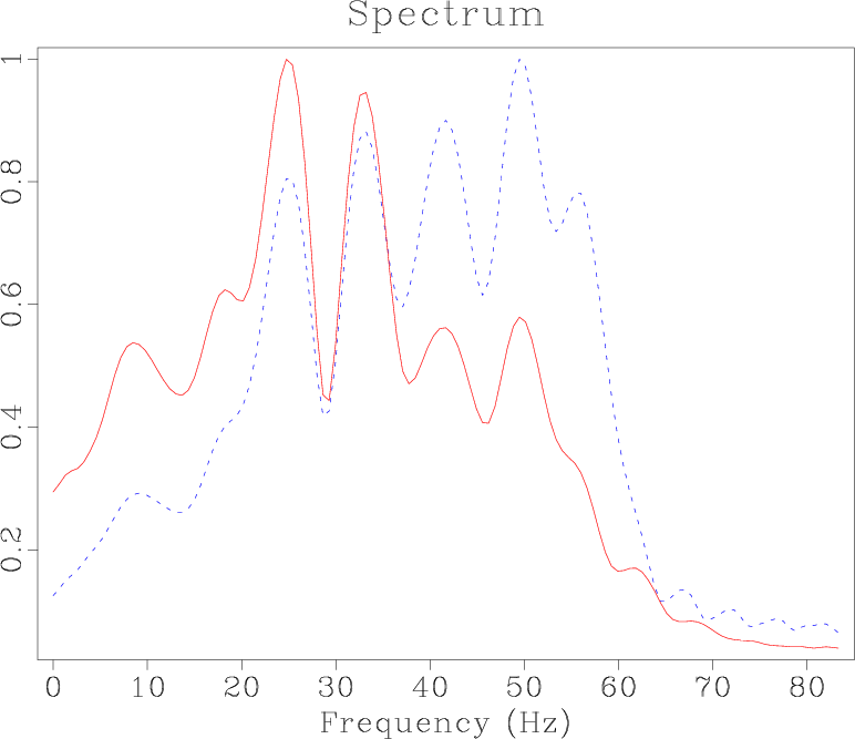
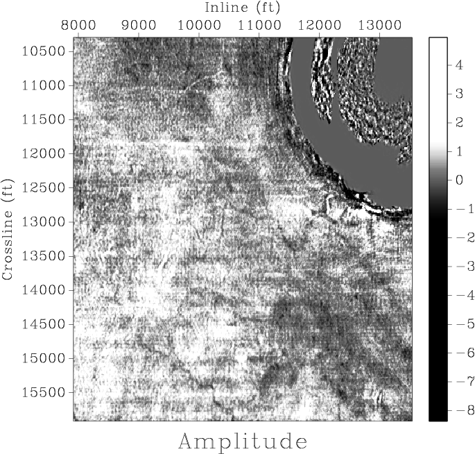
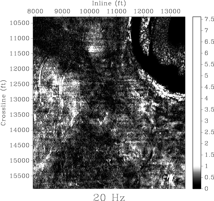
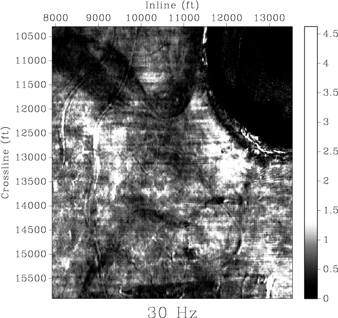
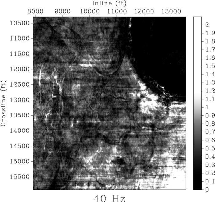
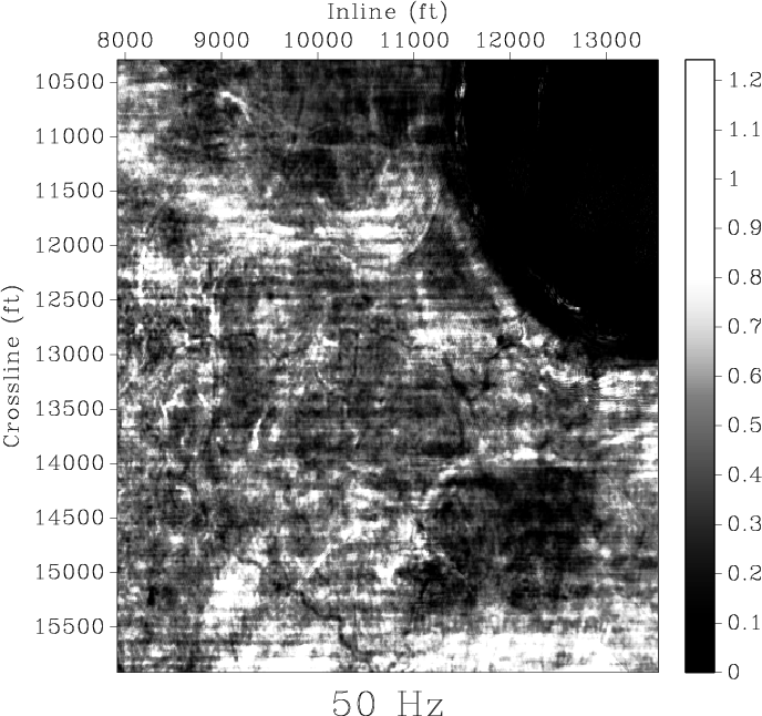
Detecting channel structures is a common application of spectral decomposition (Partyka et al., 1998). Different frequency slices show different stratigraphic features. Figure 7 shows field data from the Gulf of Mexico (Lomask et al., 2006). To generate stratal slices (Zeng et al., 1998), we flattened this data set using predictive painting (Fomel, 2010). The flattened data set is shown in Figure 8. The flattening procedure can remove structural distortions and allows the interpreter to see geologic features as they were emplaced (Lomask et al., 2006). Predictive painting does a careful job of restoring true geological frequencies, as is evident from vertical sections. Figure 9 shows the average spectrum of the data set before flattening (dashed blue curve) and after flattening (solid red curve). We calculated the spectral decomposition of flattened data using the proposed method with a five-point smoothing radius. Figure 10 shows horizon slices from six different volumes at the same level in reference time. The horizontal blue lines on Figure 8b and 8c identify where the time slice is. Comparing seismic amplitudes (Figure 10a) with spectral decomposition at different frequencies (Figures 10b-f), several channels in 30 Hz slice are easily visible. The high-frequency spectral-decomposition maps, such as the 30-, 40-, and 50-Hz slices, can highlight detailed geologic features.

|
|---|
|
chev
Figure 7. Seismic image from Gulf of Mexico. (a) Time slice. (b) Inline section. (c) Crossline section. Blue lines in (a) identify the location of inline and crossline sections. The horizontal blue lines in (b) and (c) identify where the time slice is. |
|
|
|
|---|
|
flats
Figure 8. Seismic image from Figure 7 after flattening by predictive painting. (a) Time slice. (b) Inline section. (c) Crossline section. The blue lines on (a) identify the location of inline and crossline sections. The horizontal blue lines on (b) and (c) identify where the time slice is. |
|
|
|
|---|
|
spec
Figure 9. Average data spectrum before flattening (dashed blue curve) and after flattening (solid red curve). |
|
|

|
|---|
|
slice,slice10,slice20,slice30,slice40,slice50
Figure 10. Comparison of horizon slices, from four different volumes at the same level: (a) conventional amplitude; and spectraldecomposition at (b) 10 Hz, (c) 20 Hz, (d) 30 Hz, (e) 40 Hz, and (f) 50 Hz. The slice of 30 Hz displays most clearly visible channel features. |
|
|
|
|
|
|
Time-frequency analysis of seismic data using local attributes |